Power BI Best Practice
Reference: Microsoft Power BI Desktop for Business Intelligence
The following are lifted from the Udemy course above 👆, which I found really helpful when learning PowerBI. Since new features in this software are frequently rolled out, experience and constant practice are also vital. It’s also important to keep some sort of best practice guidelines in mind, specially as data and developments scale.
Connecting and Shaping Data
- Get yourself organized, before loading the data into Power BI
- Define clear and intuitive names (no spaces!) from the start; updating them later can be a headache, specially if you’ve referenced them in multiple places
- Establish a file/folder structure that makes sense from the start, to avoid having to modify data source settings if file names or locations changes
- Disabling report refresh for any static sources
- There’s no need to constantly refresh sources that don’t update frequently (or at all), like lookups or static data tables; only enable refresh for tables that will be changing
- When working with large table, only load the data you need
- Don’t include hourly data when you only need daily, or product-level transactions when you only care about store-level performances; extra data will only slow you down
Creating Relationships and Data Models
- Focus on building a normalized model from the start
- Make sure that each table in your model serves a single, distinct purpose
- Use relationships vs. merged tables; long & narrow tables are better than short & wide
- Organize lookup tables above data tables in the diagram view
- This serves as a visual reminder that filters flow “downstream”
- Avoid complex cross-filtering unless absolutely necessary
- Don’t use two-way filters when 1-way filters will get the job done
- Hide fields from report view to prevent invalid filter context
- Recommend hiding foreign keys from data tables, so that users can only access valid fields
Calculated Columns & Measures
- Don’t use a calculated column when a measure will do the trick
- Only use calculated columns to “stamp” static, fixed values to each row in a table
- Use measures when aggregation is necessary, or to create dynamic values in a report
- Write measures for even the simplest calculations (i.e. Sum of Sales)
- Once you create a measure it can be used to anywhere in the report and as an input to other, more complex calculations (no implicit measures)
- Break measures down into simple, component parts
- DAX is a difficult language to master; focus on practicing and understanding simple components at first, then assemble them into more advanced formulas
- Reference columns with the table name, and measure alone
- Using “fully qualified” column references (preceded by the table name) helps make formulas more readable and intuitive, and differentiates them from measure references
Speed and Performance
- Eliminate redundant columns; keep data tables narrow
- Data tables should ideally only contain only quantitative values and foreign keys; any extra descriptive columns can usually live in a related lookup table
- Imported columns are better than calculated columns
- When possible, create calculated columns at the source (i.e. in your raw database) or within the Query Editor; this is more efficient than processing those calculations in the Data Model
- Minimize iterator functions (FILTER, SUMX, etc.)
- Functions that cycle through each row in a table are “expensive”, meaning that they take time and consume processing power
Data Visualization Best Practices
- Strive for clarity & simplicity, above all else
- Aim to maximize impact and minimize noise; it’s all about balancing design and function
- Don’t just build charts and graphs; create a narrative
- Without context, data is meaningless; use filters, bookmarks, and effective visualizations to translate raw data into powerful insights and implications
- Always ask yourself the three key questions:
- What type of data are you visualizing? (Integer, categorical, time-series, geo-spatial, etc)
- What are you trying to communicate? (Relationships, compositions, trending, etc)
- Who is the end user consuming this information? (Analyst, CEO, client, intern, etc)
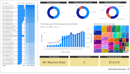
Here are screenshots of the finished dashboards:
Executive summary - features the top products by orders and revenue, and key KPIs: overall revenue, orders, and returns 
Product detail - drill-through information for each produt; includes visuals about targets, price adjustments, and profit forecast 
Customer detail - information about customer demographics